Brand Identity, Web Design
Hydration House IV
Hydration House IV is a luxurious IV treatment business founded by Ann-Marie. Her and I meet to turn her vision into a reality by creating mood boards and close communication on brand decisions. I was able to create a luxurious, tranquil brand for her clients to feel safe while getting the IVs they need.
BRAND IDENTITY
A visual system designed to feel calm, restorative, and considered at every touchpoint.
LOGO MARK
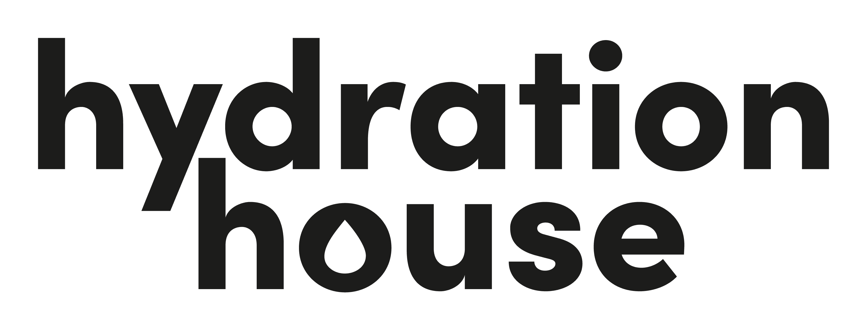
Designing a modern, recognizable logo mark that will cultivate the IV treatment company with a subtle droplet in the O for visual notification. Inspired by the refuel sports brands like Nike, Adidas, etc.
TYPOGRAPHY HIERARCHY
Primary Typeface
elegant
MoreCream · Primary and main header
SECONDARY TYPEFACE
Whimsical
Ectogenic · Used sparingly for expressive accents and personality-led moments.
TERTIARY TYPEFACE
Simplistic
Poppins Regular · Used for supporting copy, considered notes, and longer-form storytelling.
COLOR HIERARCHY
Charcoal
#1C1C1B
Ash
#979086
Walnut
#6A5D52
Vintage Sand
#B7AC9B
Brew
#303031
Stone
#E2E2DE
ASSETS
BACKGROUNDS


TEXTURES


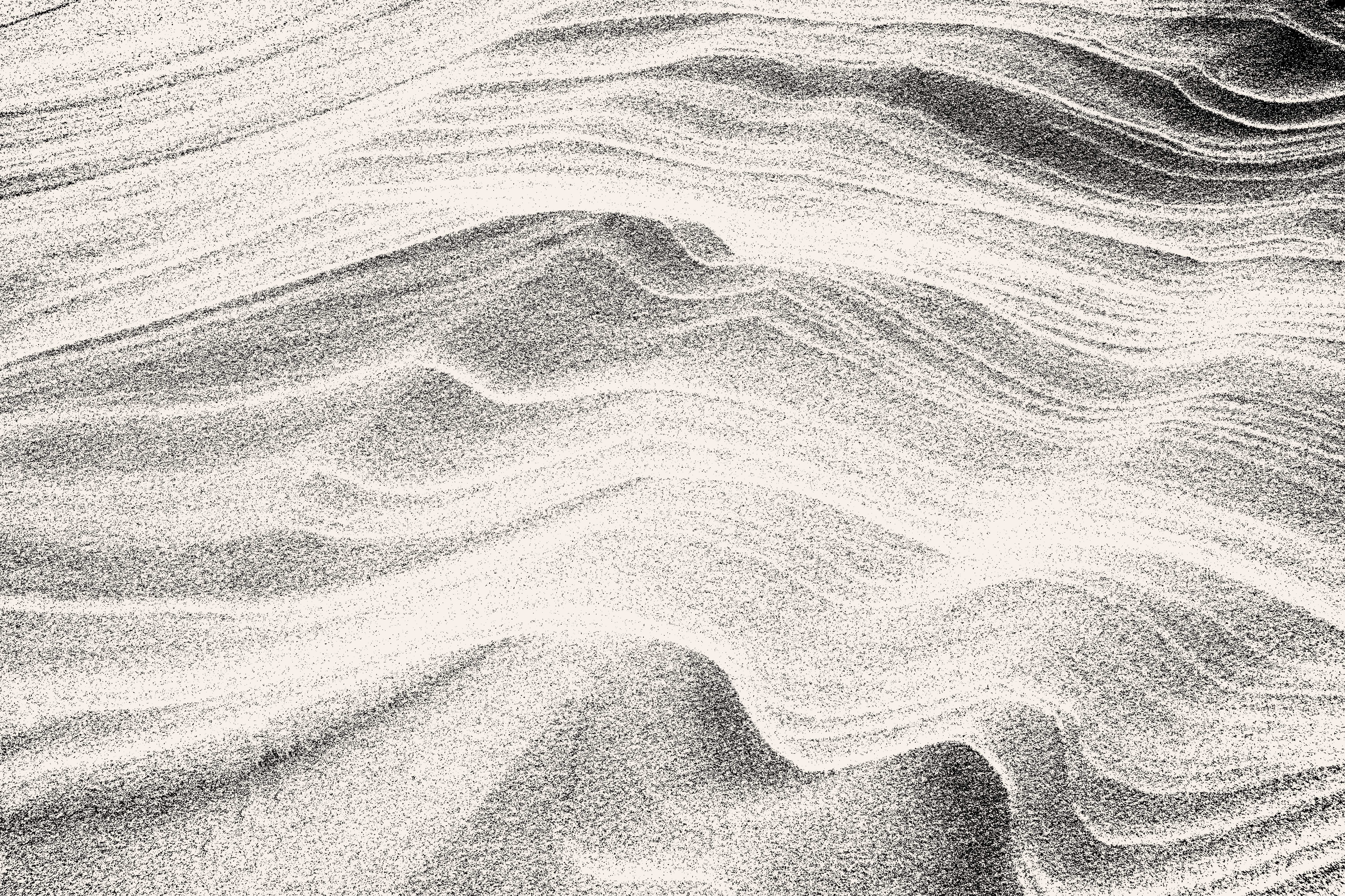
PHOTO GALLERY


Digital creation
Three responsive directions for the Hydration House IV digital experience.


CLIENT TESTIMONIAL

Ann-Marie Muscarello
Founder & CEO, Hydration House IV
MORE PROJECTS